Bookmark 05
Bookmark
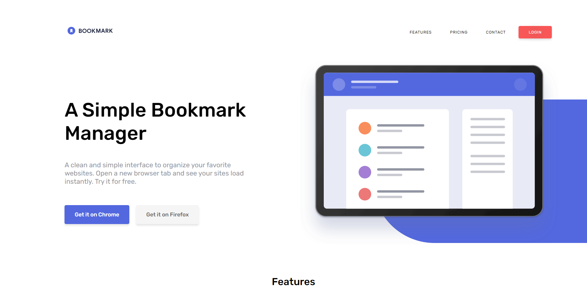
A landing page for a fictional chrome extension / Frontend mentor challenge
The main aim for this project was to practice the closest possible workflow that I would find on the job, focusing on the CSS (Sass/Scss) with some javascript. Created a pixel-perfect website with features like tabs, an accordion, and email validation. Frontend mentor provided a jpeg design file, style guide, and images.
HTML / Sass (SCSS) / JavaScript

Hover effects and Button Animations
Simple hover effects and click animations increase the user experience.

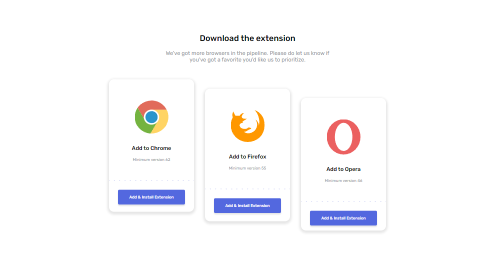
CSS Grid / Flexbox
Combination of grid and flexbox made for easy positioning and layout of these cards
Features Tabs
Tabs showcasing the different features of the chrome extension with the use of javascript.
FAQ - Accordion
Frequently asked questions accordion built using CSS.

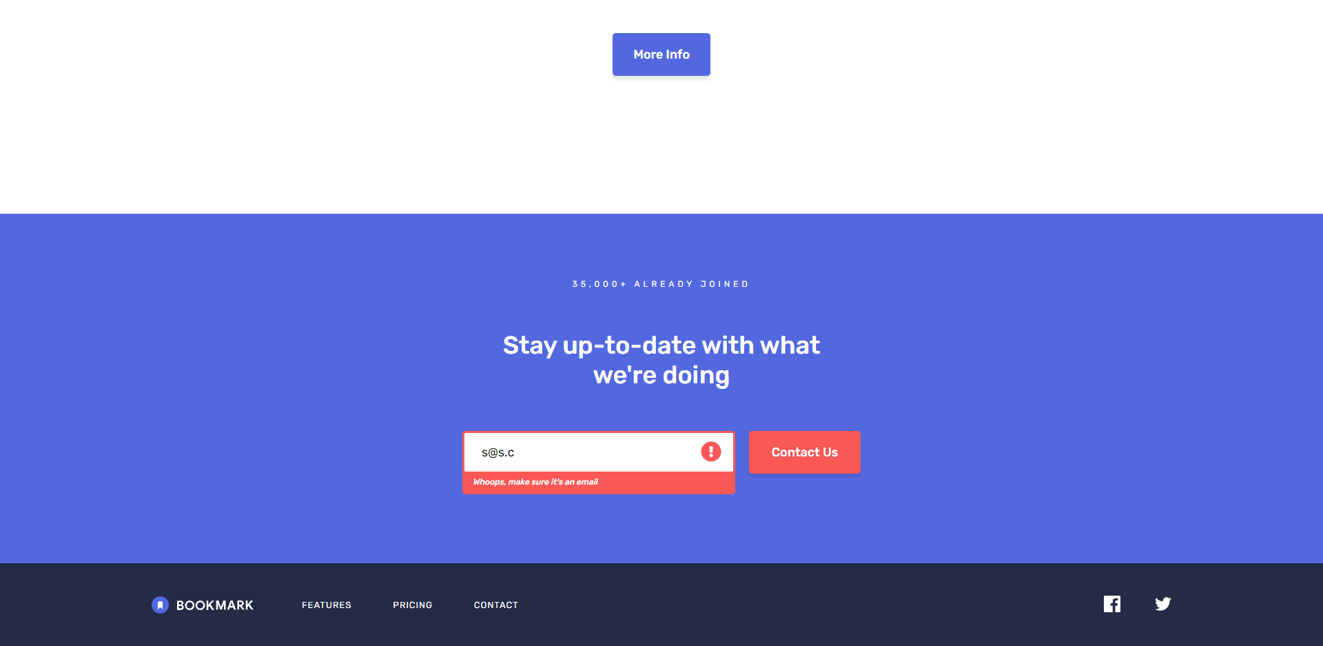
Email Validation
Email validation with error messaging using Regex.
.png)
Home page (iPhone X)
.png)
Mobile Menu (iPhone X)
.png)
Features (iPhone X)
.png)
FAQ (iPhone X)
Responsive
Fully responsive so website can be viewed on any desktop, tablet, or mobile phone.
Challenges
Making It Responsive
Too many hard widths and heights leading to many horizontal scrollbars when trying to make it responsive. Learned don't set hard widths if not needed. Use responsive units like rem or %. Make it responsive as you go, and code with that in mind.
Making an Accordion and Form Validation
Learned how to make an accordion and how to validate the form alerting the user of an incorrect entry.

Tech
HTML
SASS (Scss)
Javascript
Who am I?